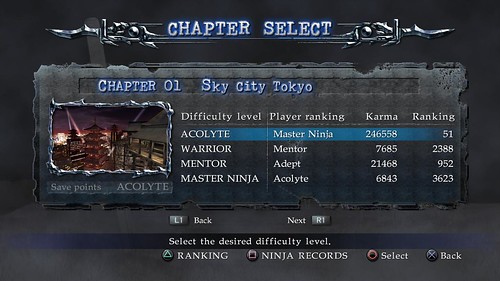
There really isn't much to complain or discuss about the menu for NG games, they are well presented and made however the menu design for Ninja Gaiden 2/Sigma 2 did not meet people's expectation in taste.
Ninja Gaiden 2 focused on Blood, why didn't we have some sort of a bloody designed menu? Another thing was the lack of interactivity, Ninja Gaiden 1/Black had design templates moving around in the black ground even though Black's menu design was aimed in a simplicity way. NG2 had nothing but a still image and some tad boring music:/
POINT- So basically what I'm saying is, Ninja Gaiden 2/Sigma 2 menu design is boring.

ANYWAY, I wouldn't brag on about the design but my biggest complain for Sigma 2's menu design was the system loading. I have no idea why next gen (current gen) games are starting to have menu design that takes their time to load. Menu design should not take more than 5sec to load. Sigma 2 had loading every time you pick a section. Whether it be Team Mission, Ninja Record, Chapter Select etc. The game will always load. I can understand Sigma 2 used NG2's menu code but the loading time was really annoying!
POINT- What I'm trying to say is Sigma 2's menu has too much loading to it or loading takes a long time
TO IMPROVE:
What ever Ninja Gaiden 3's main theme will be, blood, special effect (colour mist), the design should be focused to it. Or design should be focused around the story.
We can even accept images that loads in the background. One particular concept I love was Mortal Kombat's Deception's Menu design.
A God of War 3 type of menu design is welcome too. Or DooM 3. I just like menu with moving images or videos by the side.
Here's my concept take on how to improve the design or how NG3's menu design could look like.
If you save this image to your PS3 and view it on your tv, it's quite believable this is a real design.
Basically this menu design is like Ninja Gaiden Black with scrolling text and dragon emblem in the background. Each time you move the select button, focus points at different parts of Ryu with analyzing details.
From this example, I've selected NEW GAME, if I select LOAD GAME, focus will point somewhere else like so below
Now it's focusing on another part with annotated details.
So basically this is what the first concept does.
SECOND CONCEPT
As for this design, the text are spread to the corners, kunai used for highlighting texts, highlighted texts will glow. Sphere orb in the middle will change according to selected text, each displaying the text for Kuji-in. "rin pyo tou sha kai chin netsui zai zen"
As for the background will play a video of in-gameplay to what ever selected text.
As you can see from this second image, I've selected Team Missions and the image in the sphere orb as changed as well as the background video using a clip of Team Missions.
Making NG3's menu design is not a priority, although we would seriously want to see less loading time when navigating in around the menu. Don't forget after finishing Ninja Gaiden story, the menu background should change to something else just like NInja Gaiden Black did from Ryu to Ayane background art. Everything about Ninja Gaiden Black I love so much to death!


So when you get down to options it'll show Ryu's boot? Don't know how I feel about that, but the second design is pretty cool.
ReplyDelete